
PICKING PAINT COLORS
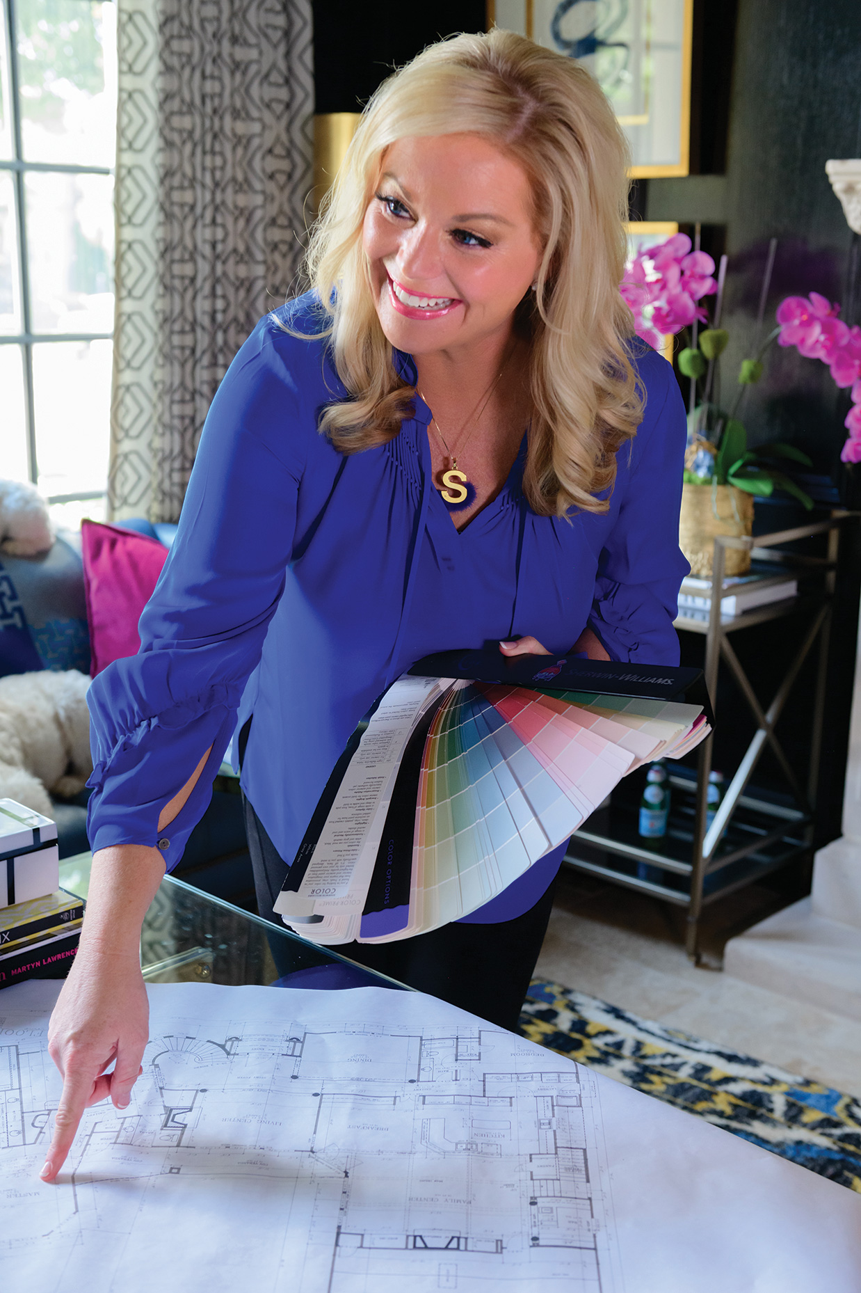
 Picking paint colors is overwhelming to most people. With expert advice, this daunting task can be made much easier. There are so many factors to consider when choosing paint colors for your home – natural light, ceiling height, the size of the space, and many others. It’s important to choose a few colors to sample for each room and then look at them in the space to consider all of the factors before making a final decision.
Our designers weigh in on a few of their favorite paint colors and why they love them.

 Benjamin Moore 2168-10 Fall Harvest “My favorite color is orange, and I love what a happy hue it is! When I was remodeling my own home, I made a bold decision to lacquer my study paneling in this warm Hermès-like orange. I’m so happy I went for it! It’s my favorite room in my home, and friends and family always comment on how cheerful it is.” Beth Rafferty, IBB Owner & Designer, @ibbdesign on Instagram

 Sherwin Williams SW7069 Iron Ore
“It’s a soft black that is a great background for a feature wall. It’s also great for cabinetry, trim, doors, and shiplap.” SUSAN NEFF, IBB Designer

 Sherwin Williams SW7004 Snowbound
“A good classic white can be so difficult and overwhelming to choose. Snowbound is a great choice for a cabinet color, wall color, and interior trim color, as it provides a crisp white look in any space! It’s definitely my ‘go-to’ white.” CASEY GATTERSON, IBB Designer

 Benjamin Moore 2065-10 Admiral Blue
“Blues are classic and work with a multitude of aesthetics. Admiral Blue is a deep rich blue that pairs well with many colors to provide rich contrast and give you a timeless look.” MICHAEL REESE, IBB Designer, @mr.maison on Instagram

 Sherwin Williams SW 1015 Skyline Steel
“It is always an easy ‘go to’ for me when looking for a warm, light gray overall interior wall color when I’m not wanting a pure white on the walls. I would lump Skyline Steel into the greige neutral family; it’s compatible with a multitude of color palettes and can often be a chameleon in its setting.” SHANNON GIDNEY, IBB Designer & Sales Manager, @designershannongidneyibb on Instagram

 Sherwin Williams SW 6248 Jubilee
“It is so peaceful and inviting. It’s a gorgeous celestial gray-blue that is perfect to use as a soft accent.” LESA NEFF, IBB Designer

 Sherwin Williams SW 7631 City Loft
“It’s a perfect neutral that goes from a soft, warm gray to light greige depending on lighting. It blends beautifully with everything!” TERRI HUNTER, IBB Designer

 Sherwin Williams SW 6258 Tricorn Black
“It’s a beautiful subdued black that works with pretty much any architectural style! The warm neutral base make a fantastic background to feature an art collection.” JORY GATTIS DICKINSON, IBB Designer, @jorya.gattis on Instagram

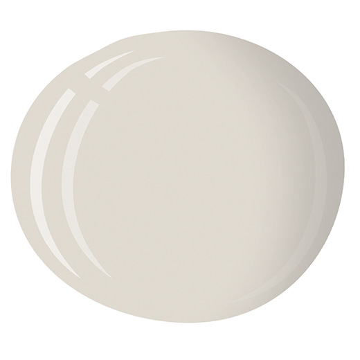
 Sherwin Williams SW 7008 Alabaster
“My favorite go-to paint color is Alabaster from Sherwin Williams. It has a nice warmth to it and instantly brightens up any space.” LAUREN MACNAK, IBB Designer, @laurenmacdesigner on Instagram
**Pro tip: Always sample the paint in your space before diving in and painting the entire room. Just because it looks fabulous in your friend’s home, doesn’t mean it will look equally as stunning in your home. There are many factors that can influence how paint looks in a space.**