Spring 2017 One Room Challenge: Week One
If you follow me on Instagram, then you know that I’ve had a hard time trying to decide which room to tackle for this season’s One Room Challenge. We sold our previous home fully furnished a little over a year ago and took on remodeling our new home. I’ve got quite the to-do list here as we have several rooms with little or nothing in them! You may have seen our laundry room & my daughter Brooklyn’s bedroom that I completed during previous One Room Challenges. The first season I participated, I made over my oldest daughter’s bedroom & it’s still one of my favorite transformations.
This season I’ve decided to take on our study/home office. We spend a lot of time in here as a family. Our girls often do homework in here as I catch up on emails for the day. My hubby works with our daughter Brooklyn on the computer nightly going over games & skills she’s learning in kindergarten. Our sweet Boxer, Roxy, loves this room because it’s on the front of our home & she has great views to manage her post as “guard dog” for Casa de Geyer ????.
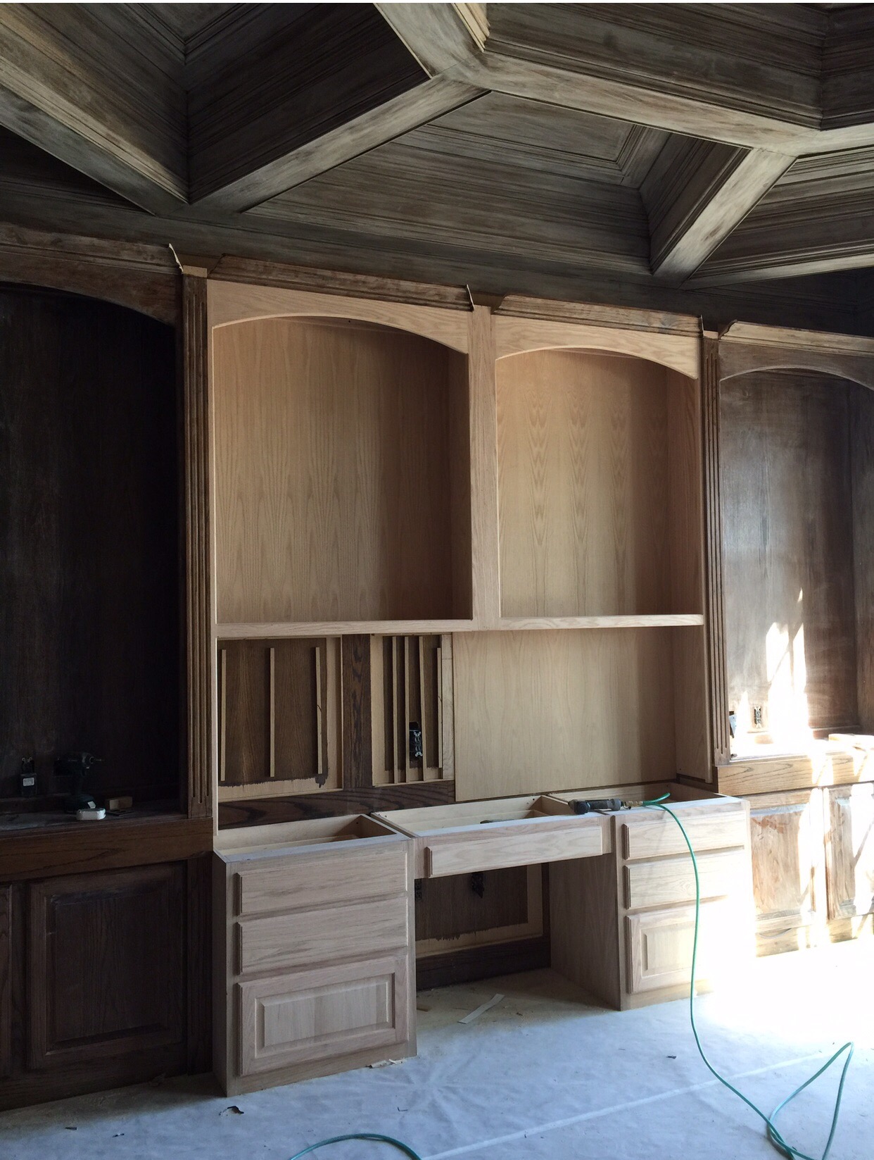
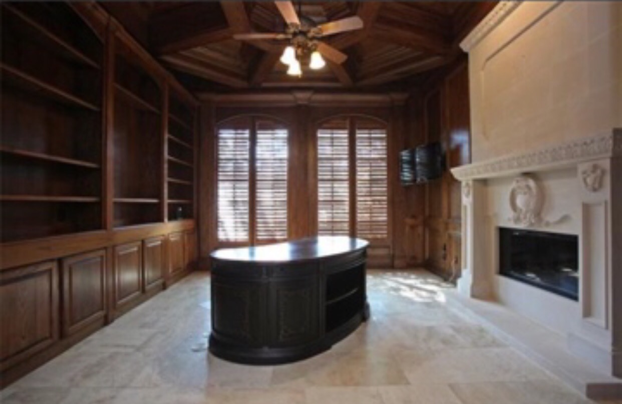
The above photo shows what the room looked like when we first purchased the home. Orangey brown paneling, ceiling, shutters & bookcase – ick!!!
Inspiration:
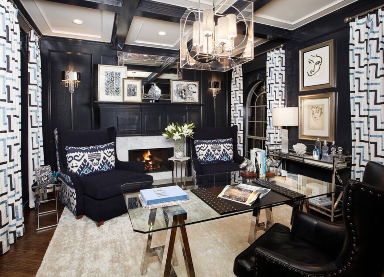
The study in our previous home was one of my favorite rooms. The walls were lacquered in Farrow & Ball’s Off Black which actually read a very rich navy in our study.
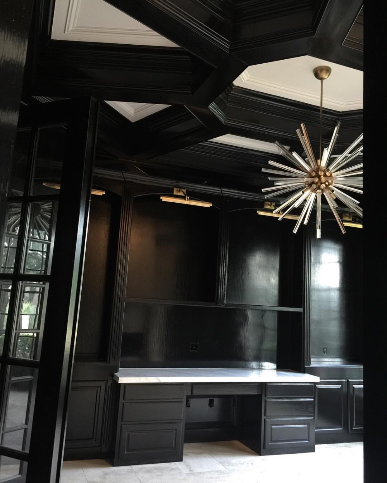
In our new home, I’m using “Shay Blue” as a more dominant color in several rooms so I wanted to go a different direction in the study. I found this photo on Instagram one day & I absolutely love it! High gloss black paneling, acrylic & brass chandelier- yes ma’am! I’ll need to maximize our seating since we use this space a lot together as a family. The room will also definitely need a desk. Now, y’all know I love color, so I’ll be adding a few POC’s (pops of color) in here for sure! I’m not sure who the designer was on this space so if y’all know – let me know so I can properly credit. The chandelier is actually the same one I used in my daughter’s Kate Spade bedroom in our previous home. It’s always been a favorite fixture of mine so I’ve decided to use the larger version in the study for our new home. 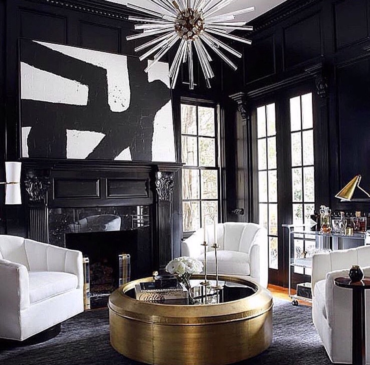
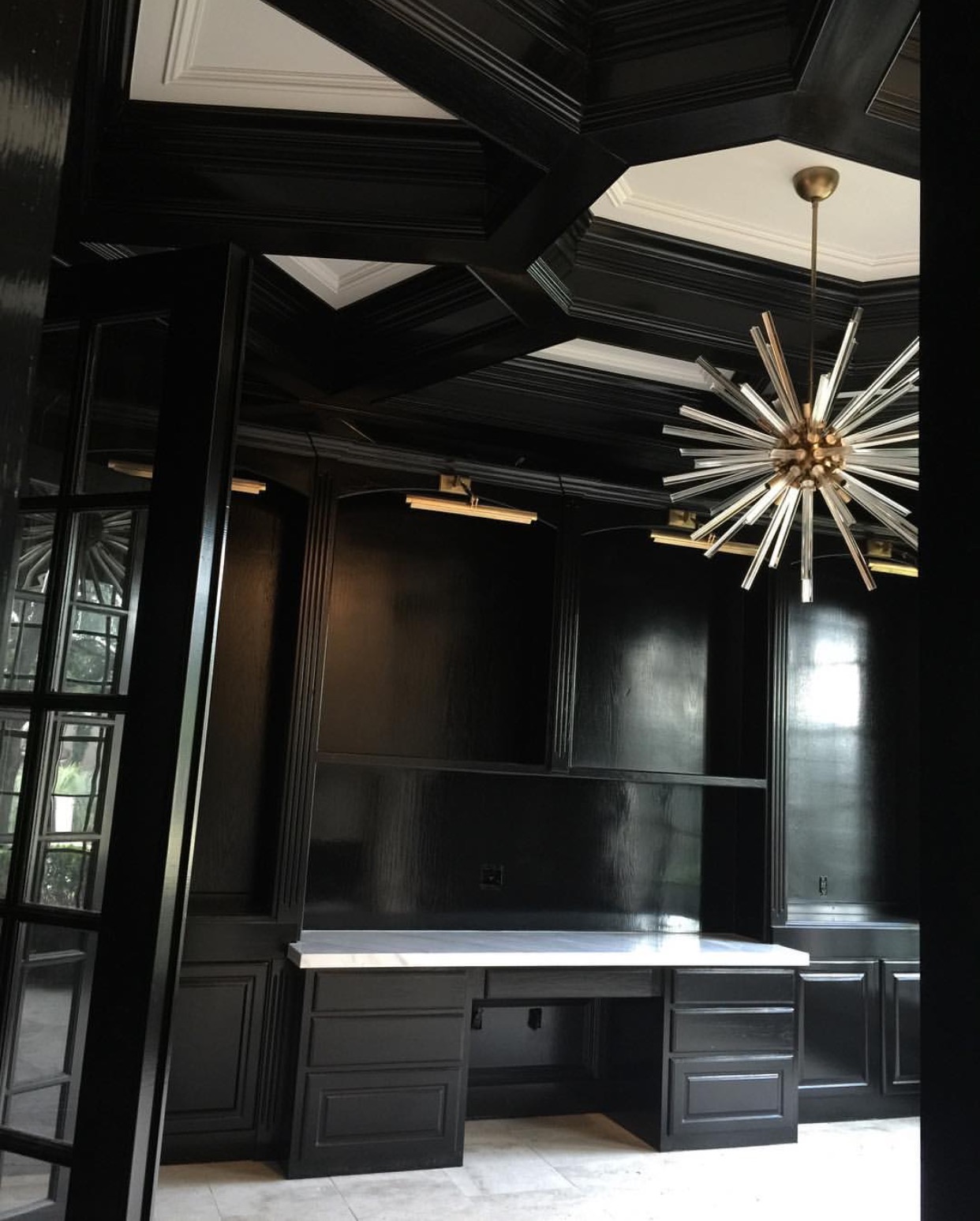
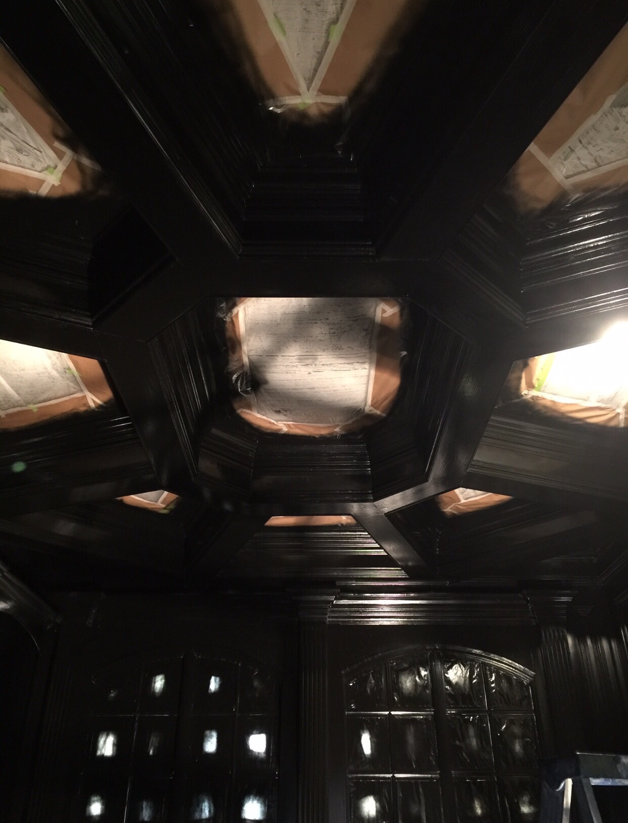
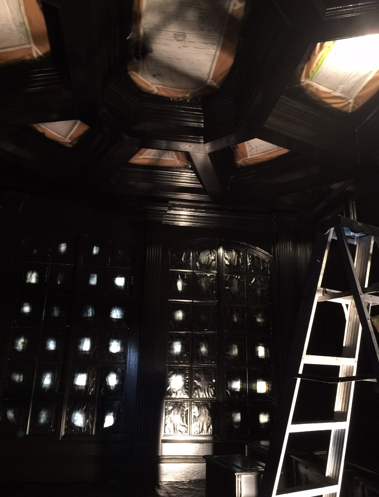
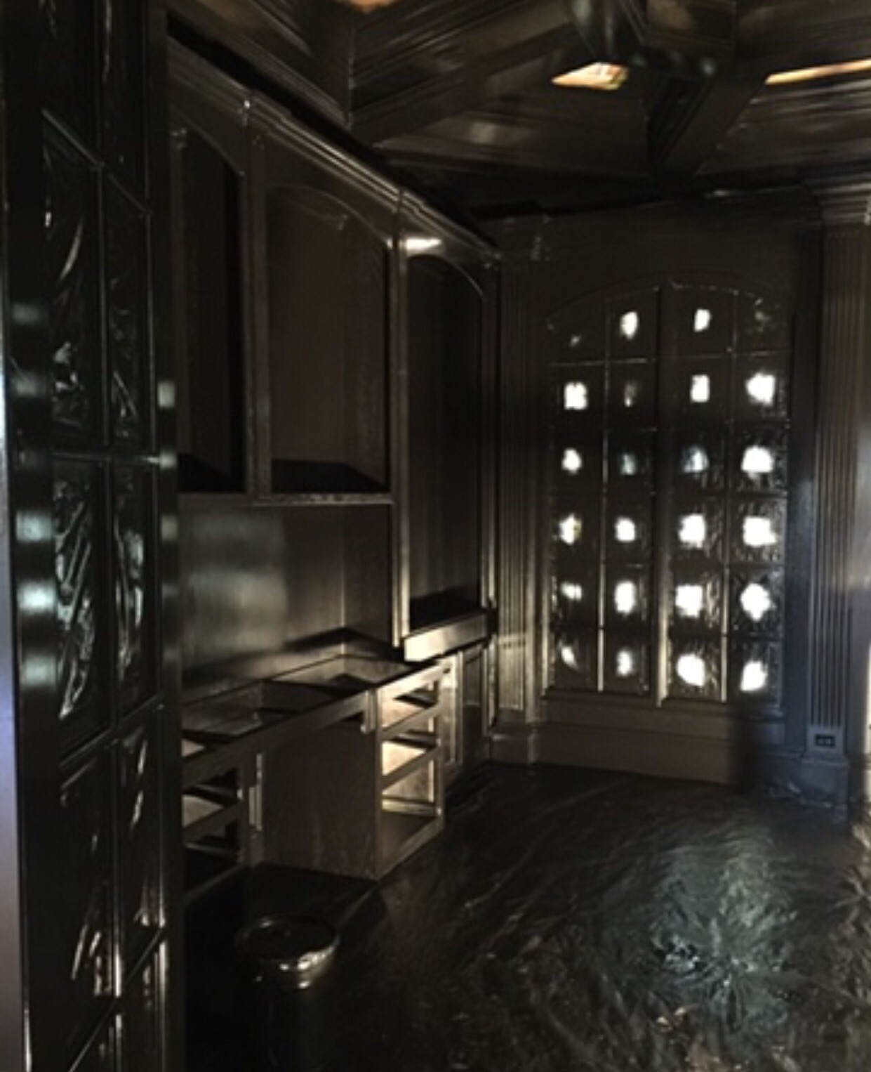
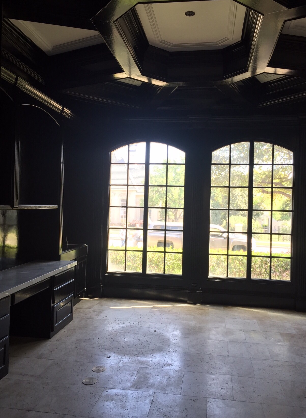
So, most of the main finish out was done when we remodeled the house last year. I have a few tricks up my sleeve that I still want to add. Here are a few progress/transformation shots from during our remodel.
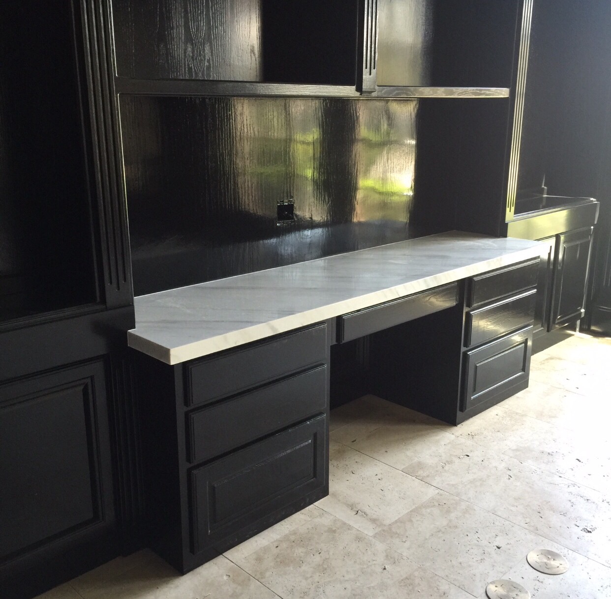
I re-configured the center of the bookshelves with a built in credenza to allow a workspace for our desktop computer.
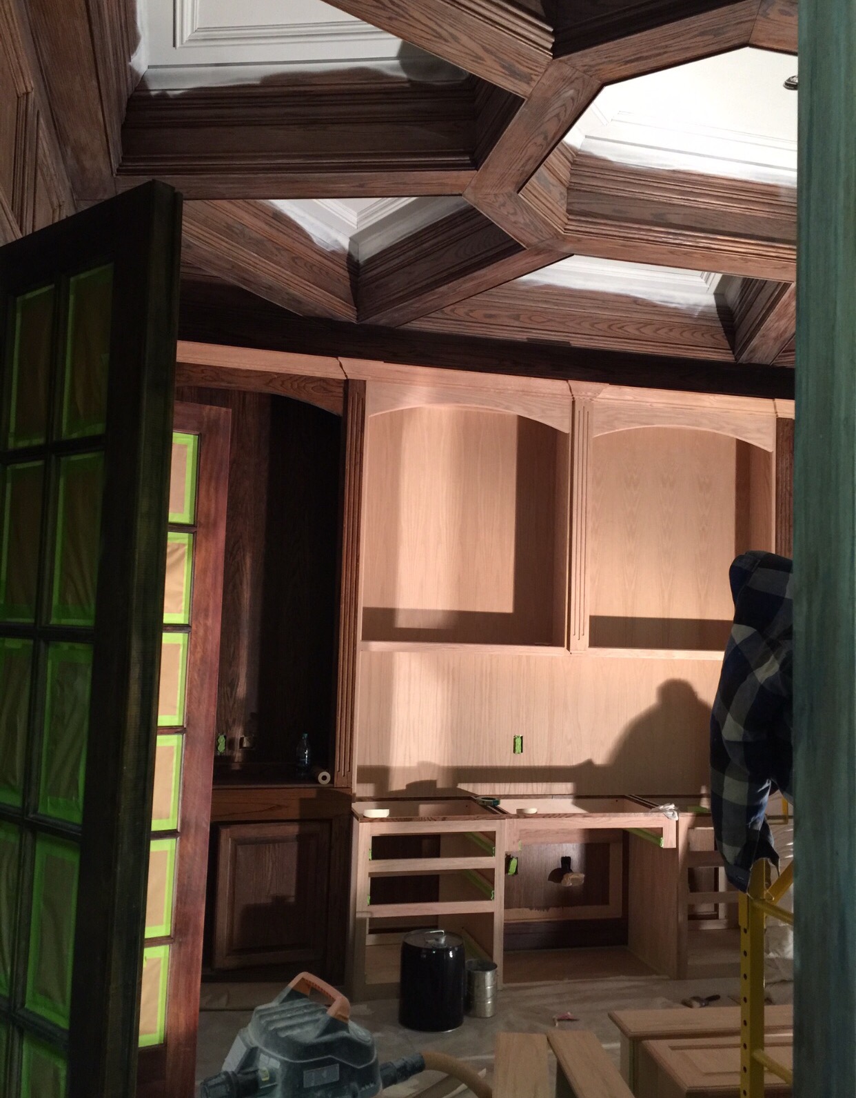
The ceiling in here is so fabulous! The millworker in our home is one of the main reasons I fell in love with it. I made the ceiling detail really pop by painting the inside a bright white to contrast with the high gloss black.
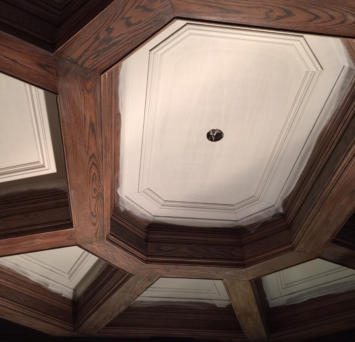
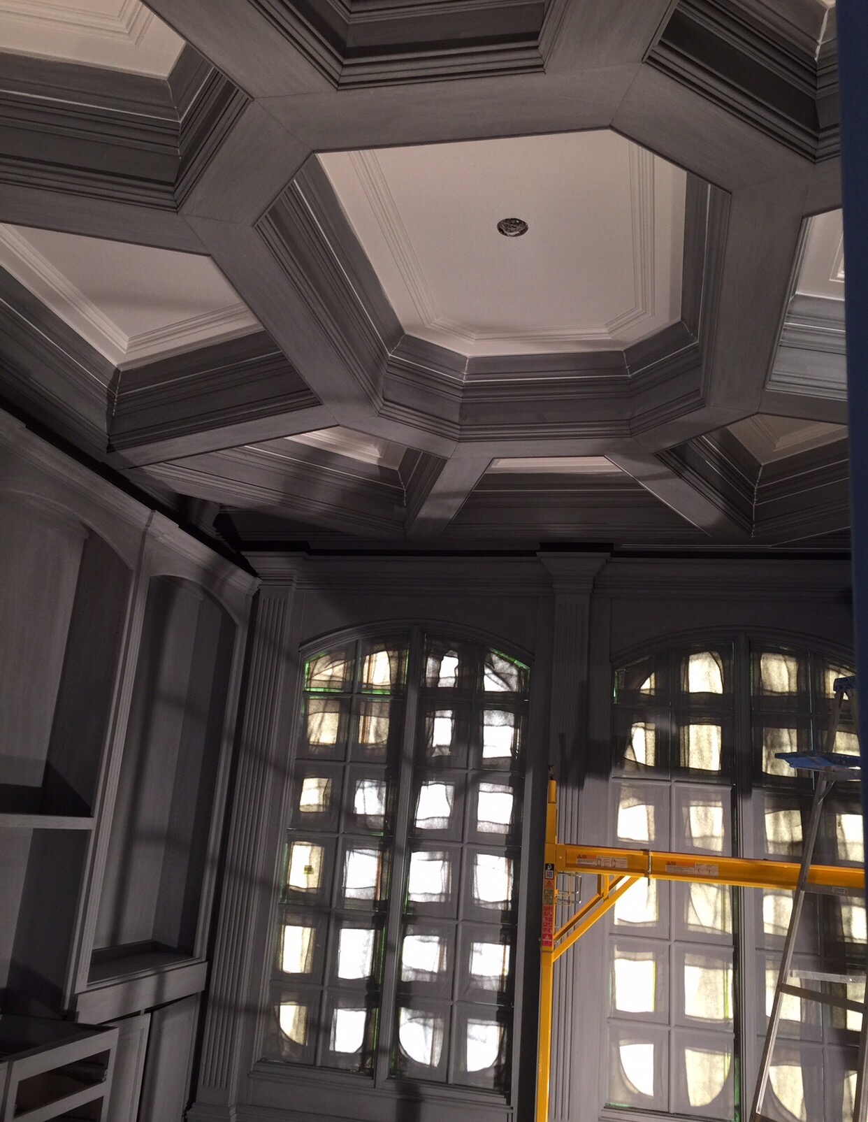
Always prime before you paint – especially when you’re painting over stain grade wood. Our wood in here is red oak so even with two coats of primer & a few coats of black, you still see some of the grain when the light hits it. I had a painter tell one of my clients a few weeks ago that they didn’t need to prime the walls that we were taking from a darker shade to a lighter shade. No sir! We won’t get the true color. You will absolutely be priming the walls!
Love the cast stone fireplace in here! It’s more traditional than I would have designed had we been building from scratch but the room is going to have a mix of aesthetics so I’m leaving it as is. I’ll be blending a more modern desk & a clean lines on classic frames for upholstery. 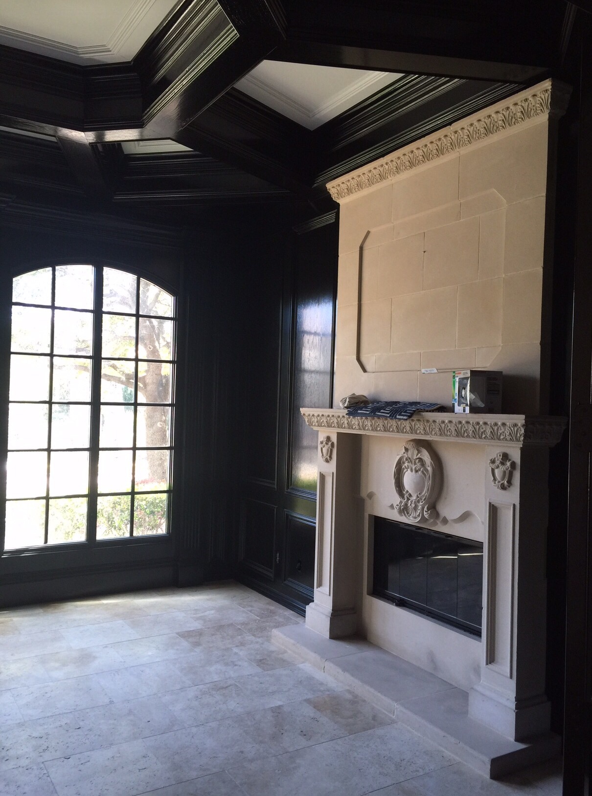
New Calcutta Gold countertops for the credenza.
Light fixture hung, paint complete & all ready for new furniture & drapery!
Stay tuned for more of my game plan & updates next Thursday! In the meantime, follow me on Instagram & my Instagram stories for sneak peeks into client projects & my daily life at IBB Design!

