Balance and Harmony: Understanding the Rule of Thirds in Interior Design
 THREE is the magic number, and the Rule of Thirds is a magical guiding principle in our world. It’s become so embedded in the fabric of design that we often overlook its influence. Used by photographers, painters, architects, illustrators, cinematographers, and even in Mother Nature herself, the aesthetics and details of this rule have a profound impact on everyday life.
 So, what is the Rule of Thirds? Dating back to the Ancient Greeks, the golden mean is a mathematical structural device based on the patterns of nature and has been used by artists and designers for centuries. Essentially, it states that when a line or space is divided into thirds, the human eye prefers groupings of three or other odd numbers, which makes the result more pleasing and natural, rather than breaking it up into halves or quarters. Visually, we process information through recognition and pattern, with three being the smallest number to create a repetitive composition. Imagine the grid lines on your phone’s camera; the Rule of Thirds is a similar guideline that divides a frame into three sections, placing objects in the left, right, or center to create a balanced, visually-compelling image.
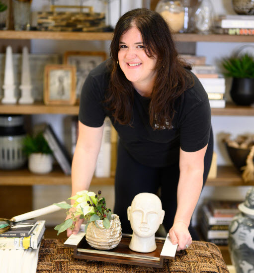
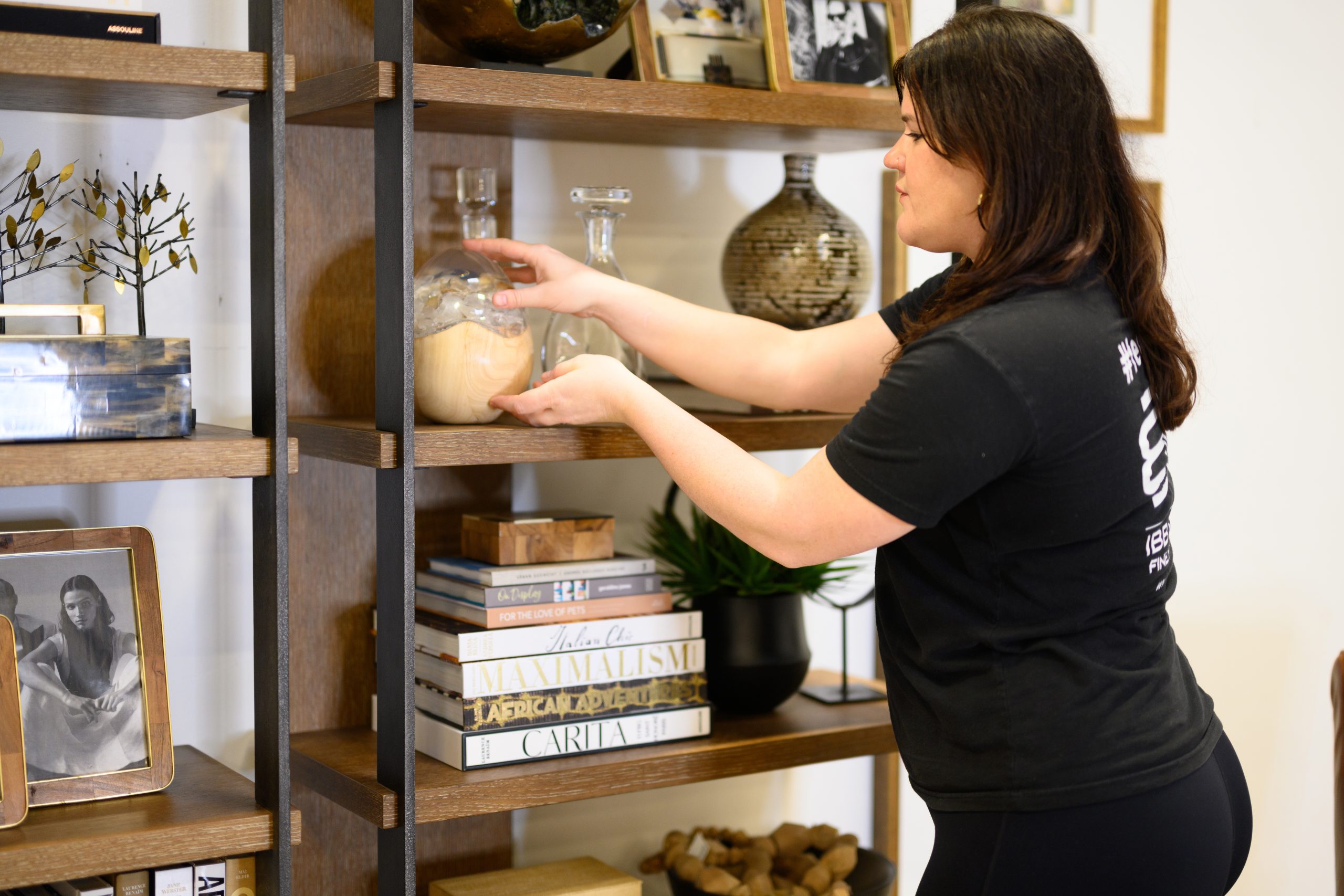
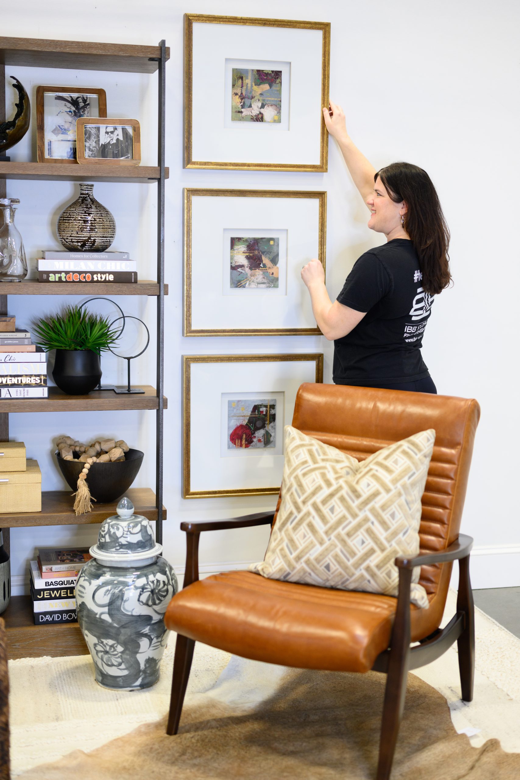
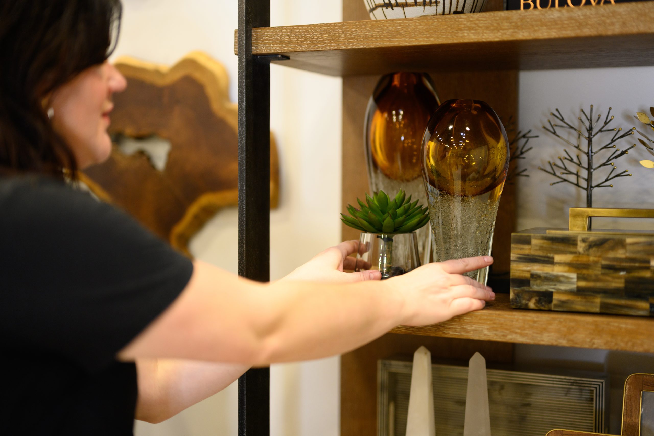
I use this particular concept in my design work almost daily as a visual merchandiser at IBB. By applying it to the scale of items in the space or the actual pieces of furniture or the number of accessories, I’ve seen firsthand how the power of three can transform spaces. It makes it easier to anchor the space, as there is always a center to work from. A vignette on a bookshelf, a trio of pillows on a loveseat, three pieces of art; each of these groupings adds an allure that’s both striking and harmonious.
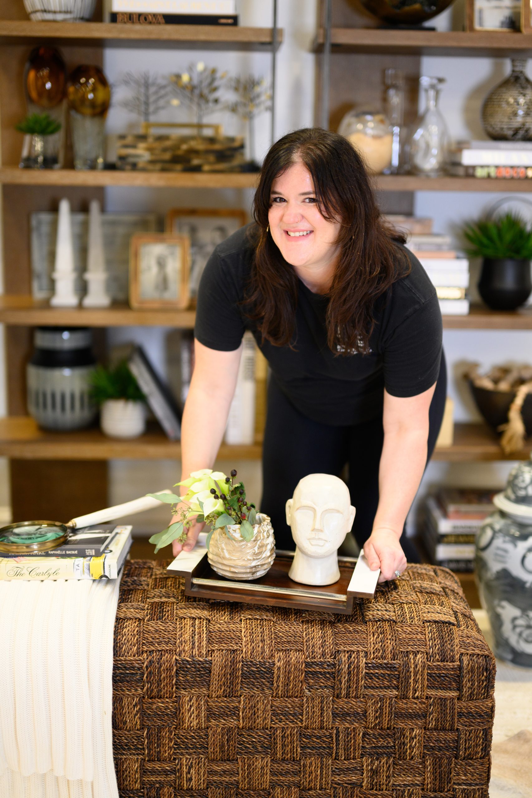
Not sure where to begin? Start small with your cocktail table or etagere. Arrange items in a series of three with varying heights, shapes, and textures to add interest. The components can be a trio of vases, a stack of coffee table books, and a meaningful decorative object. Play with the arrangement until it looks good to you. On a bed, toss three pillows. Behind your headboard, hang three pieces of art. In your garden, or plant three colors of flowers. The options are endless! The items don’t have to be matching either. In fact, the more variety, heights, sizes textures, tones, the better. Introducing three of anything allows you to create a pattern without any restraints to keep everything the same. There is freedom in the power of three, which is both beautiful and memorable.
Remember: the rule of thirds is just a guideline and shouldn’t be adhered to mechanically, as the eye will often produce a better alternative to the grid approach. However, it can be a useful tool to help bring balance when a layout or space just isn’t working, especially in those first few projects where you may come across a challenge in getting the balance just right.
The rule of thirds can be a designer’s magic charm, an assurance of balance and beauty in any design venture. So, the next time you’re contemplating how to style a console, what to put in front of your dining room windows, or even how to make your game room look more sophisticated, don’t forget the power of three! Using the rule of thirds adds visual depth and simply makes a space more satisfying to look at and live in. It’s like a designer’s cheat sheet. You really can’t go wrong—it’s scientifically proven!

