Fall 2016 One Room Challenge: Week One
It’s that time of year again! I’m very excited to be participating in the One Room Challenge for the third time. If you’re joining our blog for the first time, you can check out my older daughter Jaylie’s Kate Spade inspired bedroom here & our laundry room makeover here. If you follow me on instagram, then you may have seen that we sold our home in January (fully furnished) to a wonderful family relocating to our area & moved into a new home & onto a new project. We did a pretty expansive remodel taking on the task of updating the 16 year old home. I fell in love with the architecture, trim work & overall bones of the home but much of the home was very dark. Unfortunately the previous owners of the home had made a few unfortunate design decisions and those also needed to be addressed. Seeing as we’re pretty much starting from scratch with furnishings & a blank slate for each room, it looks like I’ll have content for many many more One Room Challenges!
I decided to tackle the bedroom & bathroom of our 5 year old daughter, Brooklyn, for this challenge. Her room in our previous home was a bunk room.
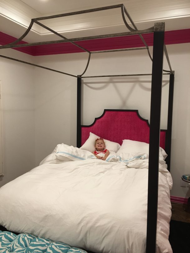
Our new home has a separate bunk room, so Brookie will be getting a new queen size bed – which she is very excited about & has a very clear vision for what she wants ?.
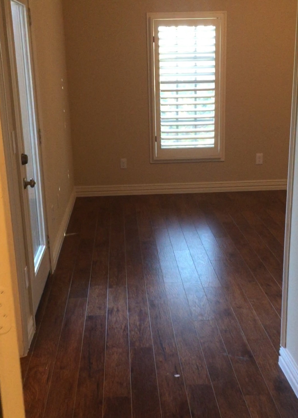
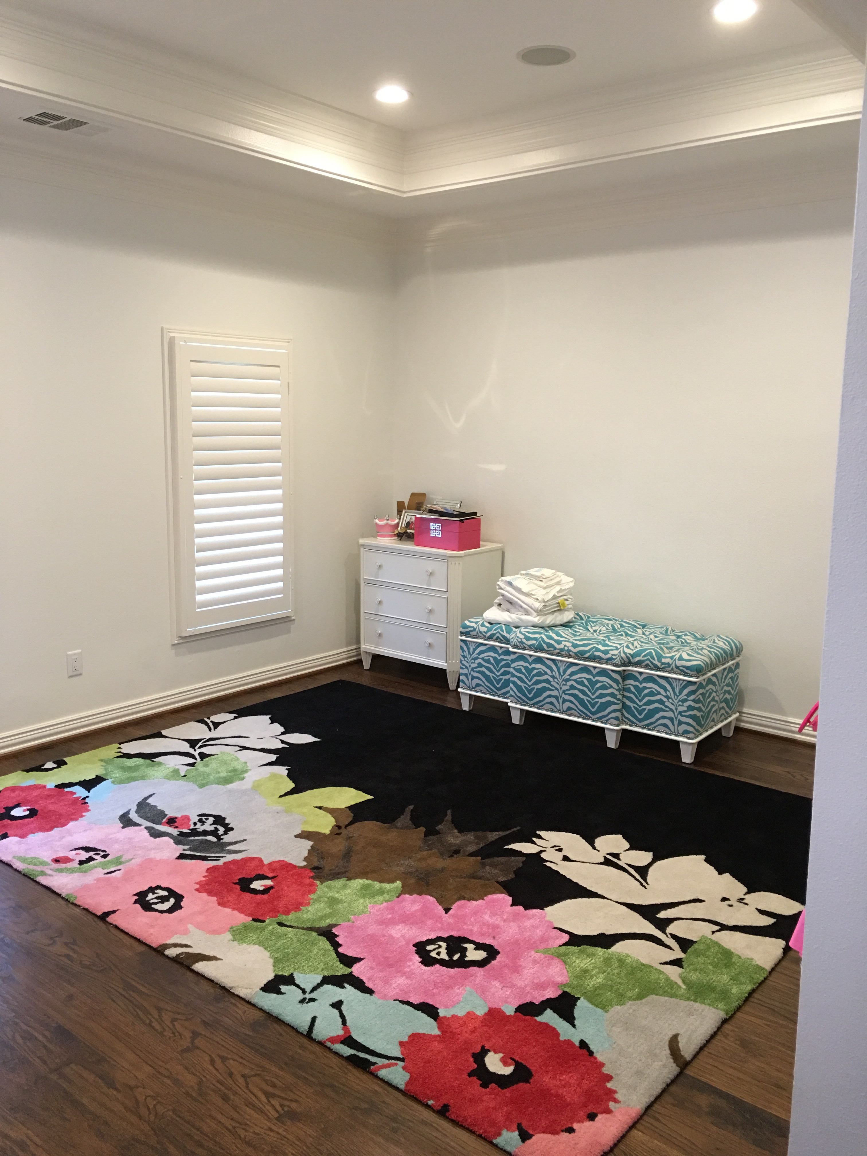
Here is what her room looked like the day we bought the house.
After experiencing some water damage, the previous owners had replaced all of the upstairs flooring with the faux wood seen here.
As part of the remodel, we installed new hardwood flooring.
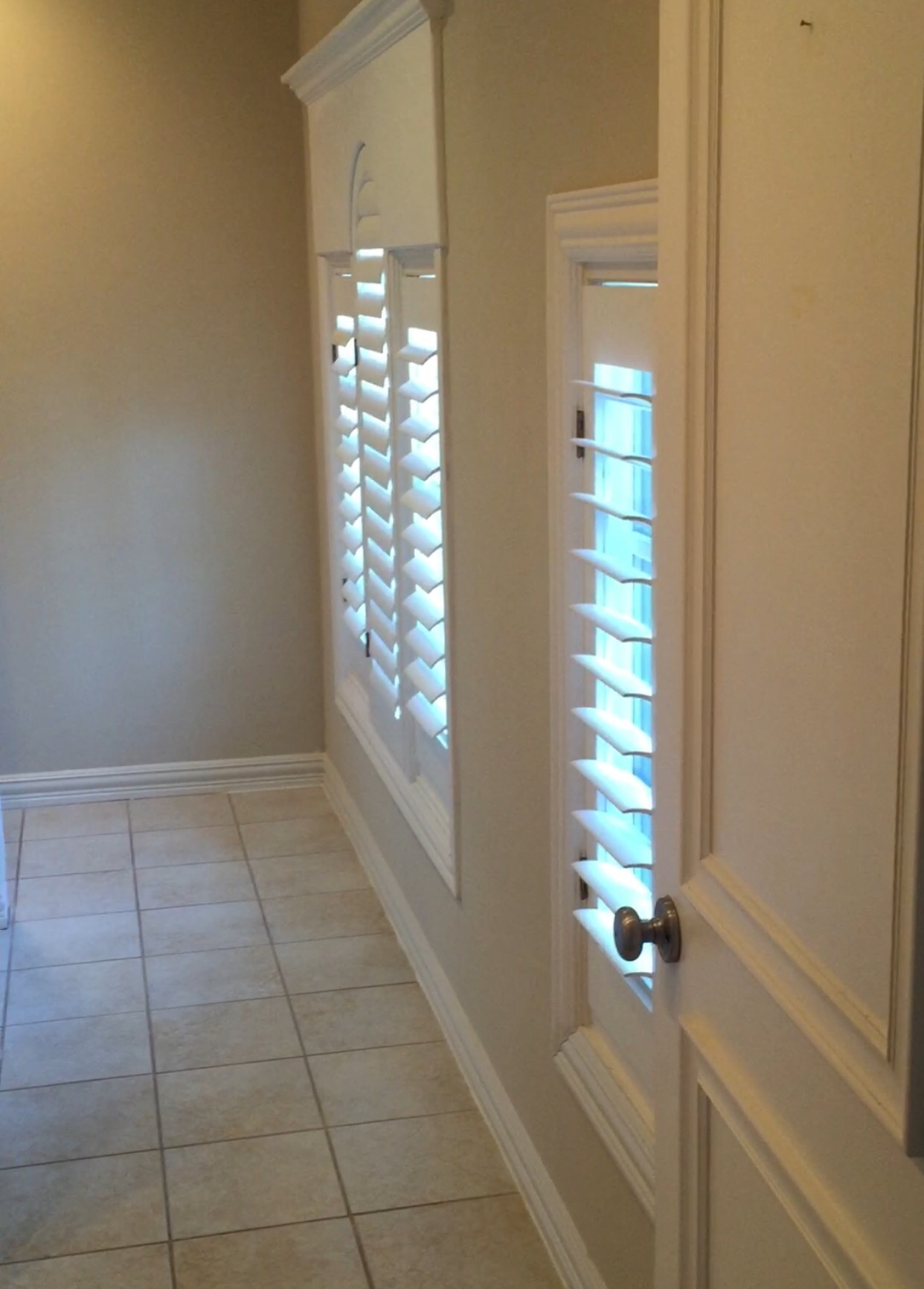
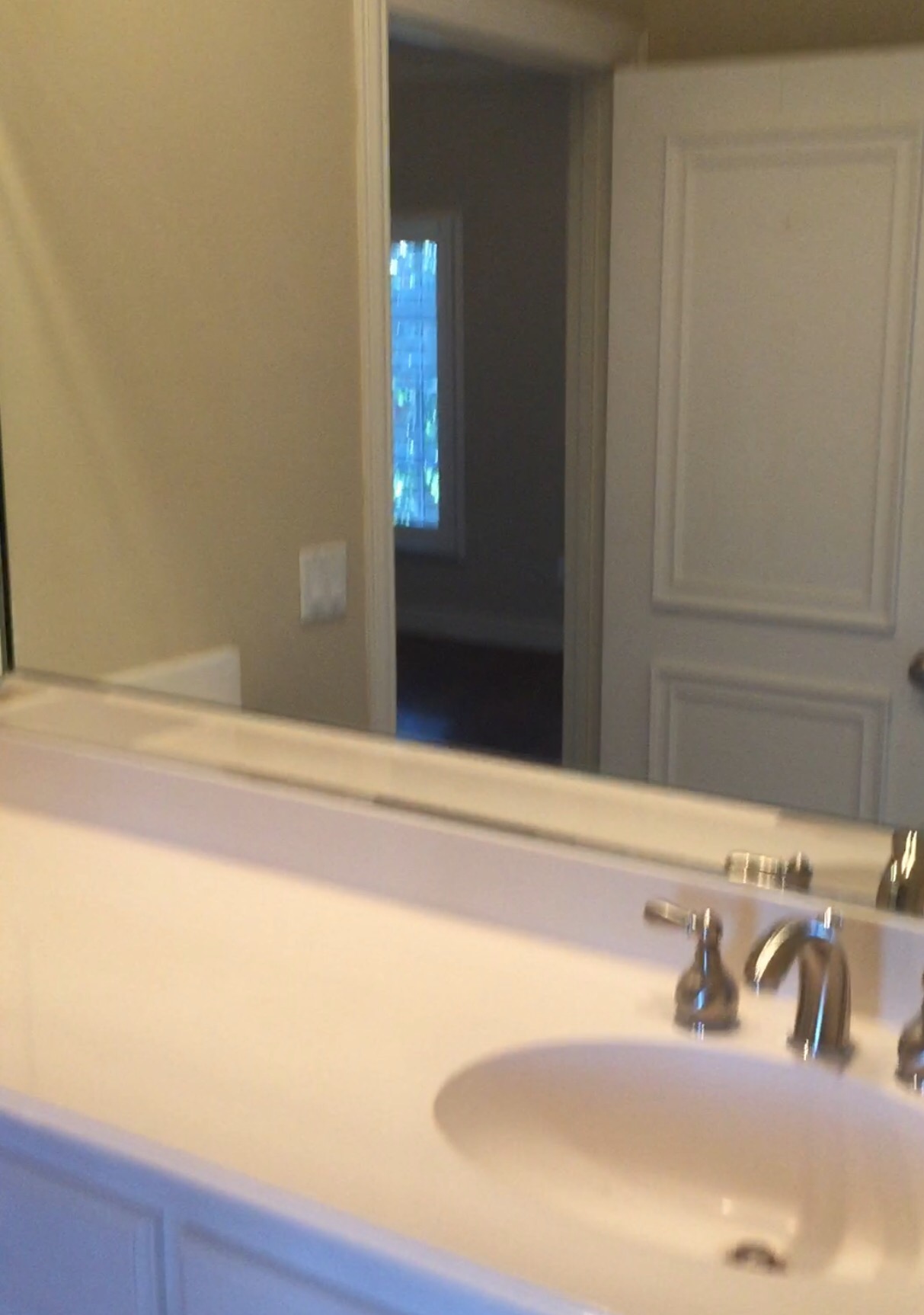
Brookie’s bathroom received a major overhaul. Here are a few before photos
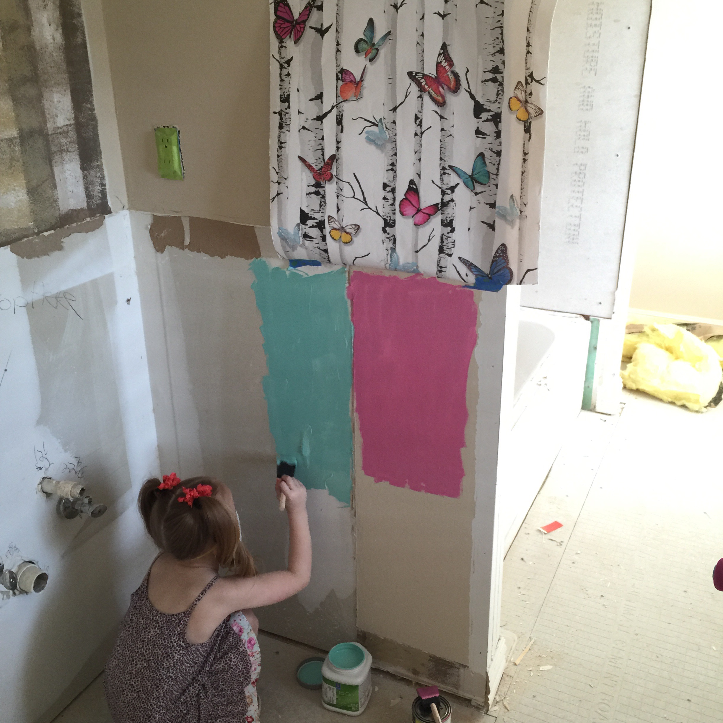
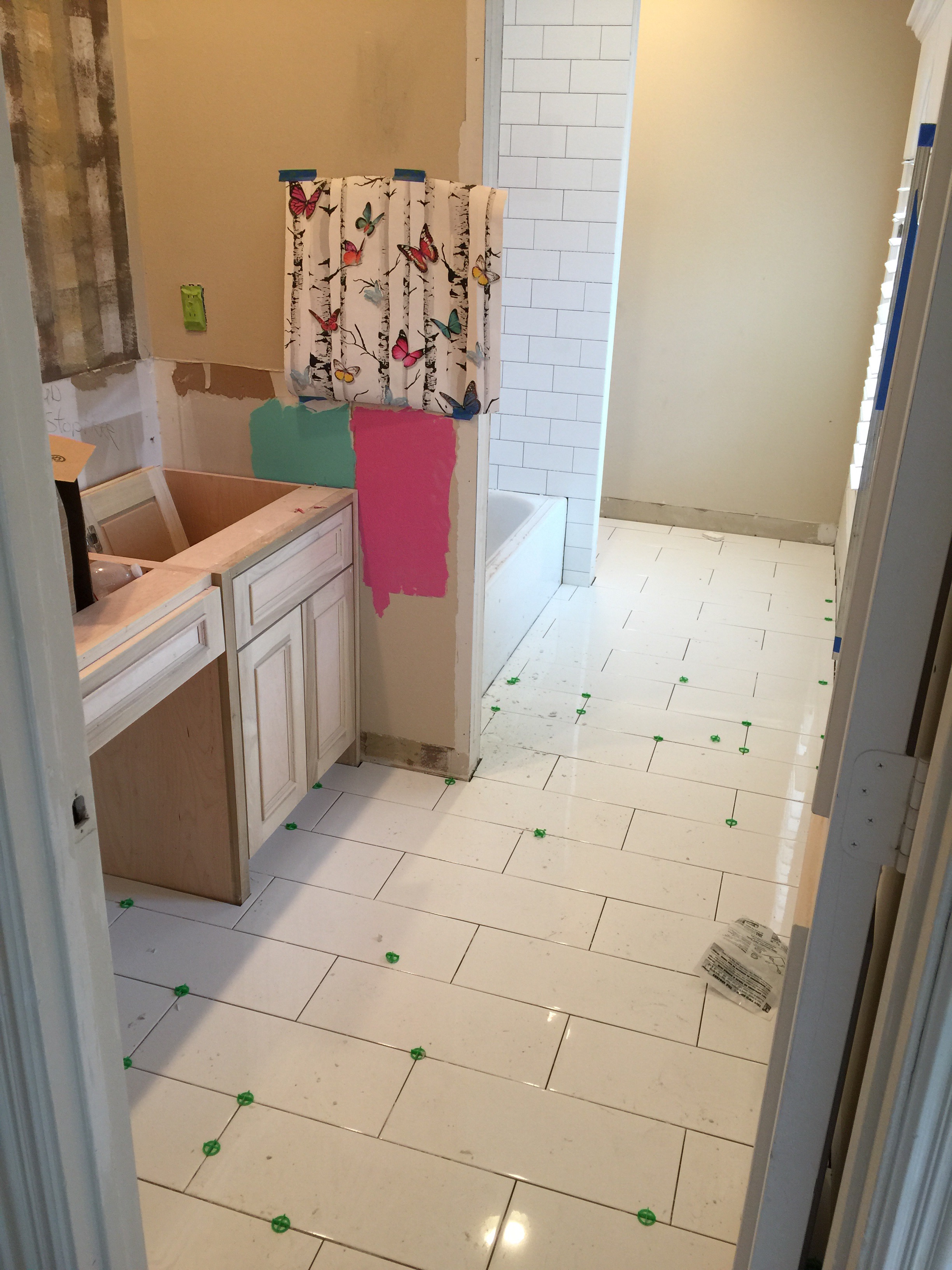
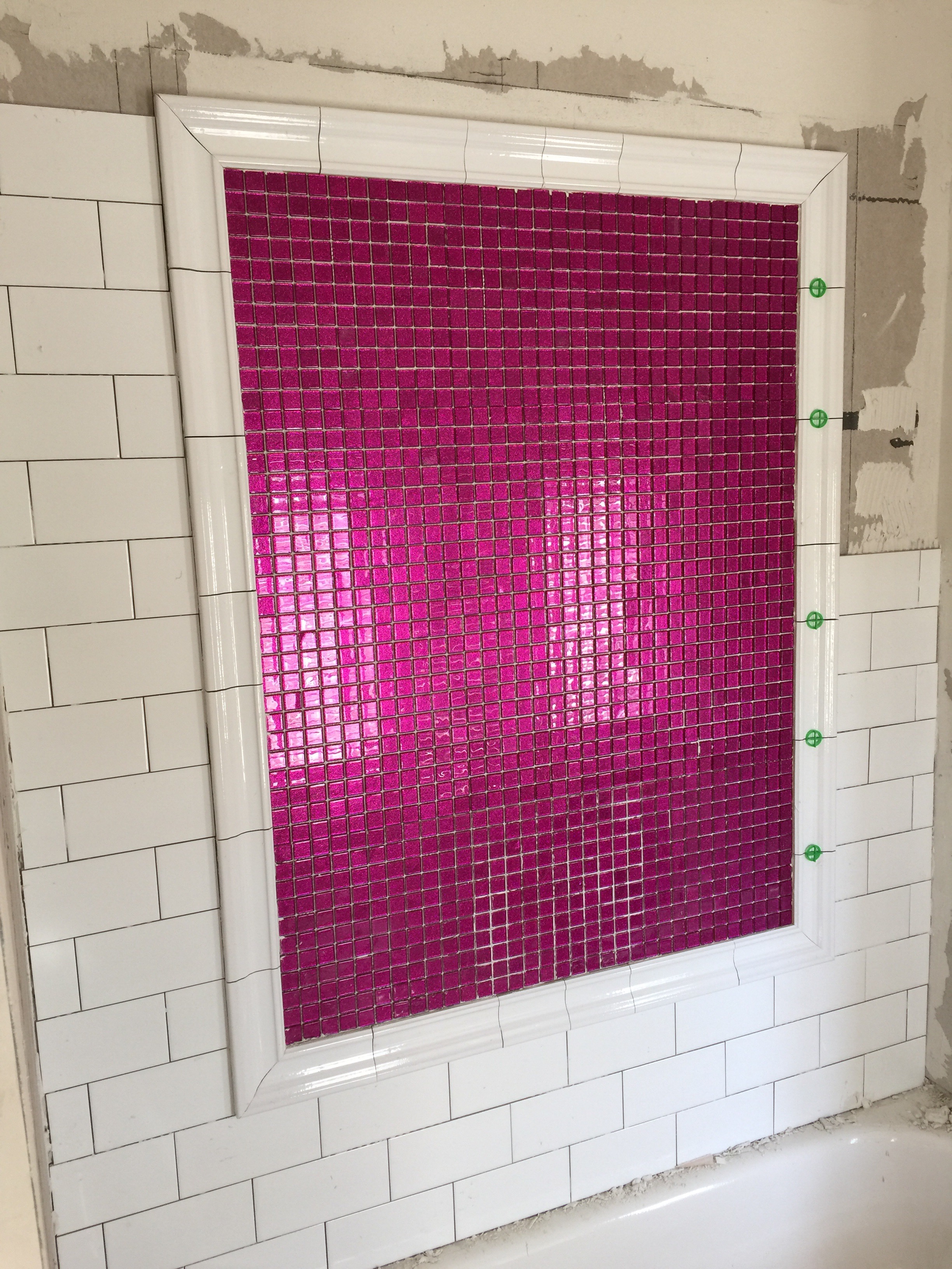
Here are a few photos in progress during her bathroom remodel.
She wanted butterflies in her room & she loved this wallpaper I found so we decided to use this as the jumping off point for her bathroom & bedroom ?. She is a pink girl at heart but really loves Aqua too so we sampled both colors to select which one we would use on her bathroom vanity.
With the wallpaper being so colorful & busy, I wanted the floors to remain more neutral & classic. I chose white 12×24 tile & installed it on a staggered brick joint on the floor & a smaller size in the shower.
My girly girl literally would be totally fine with everything being pink! When I found this hot pink 1×1 mosaic, I had to work it in somehow. A picture frame centered on the shower wall was the perfect way to add a splash of my sweet girl’s personality without going overboard.
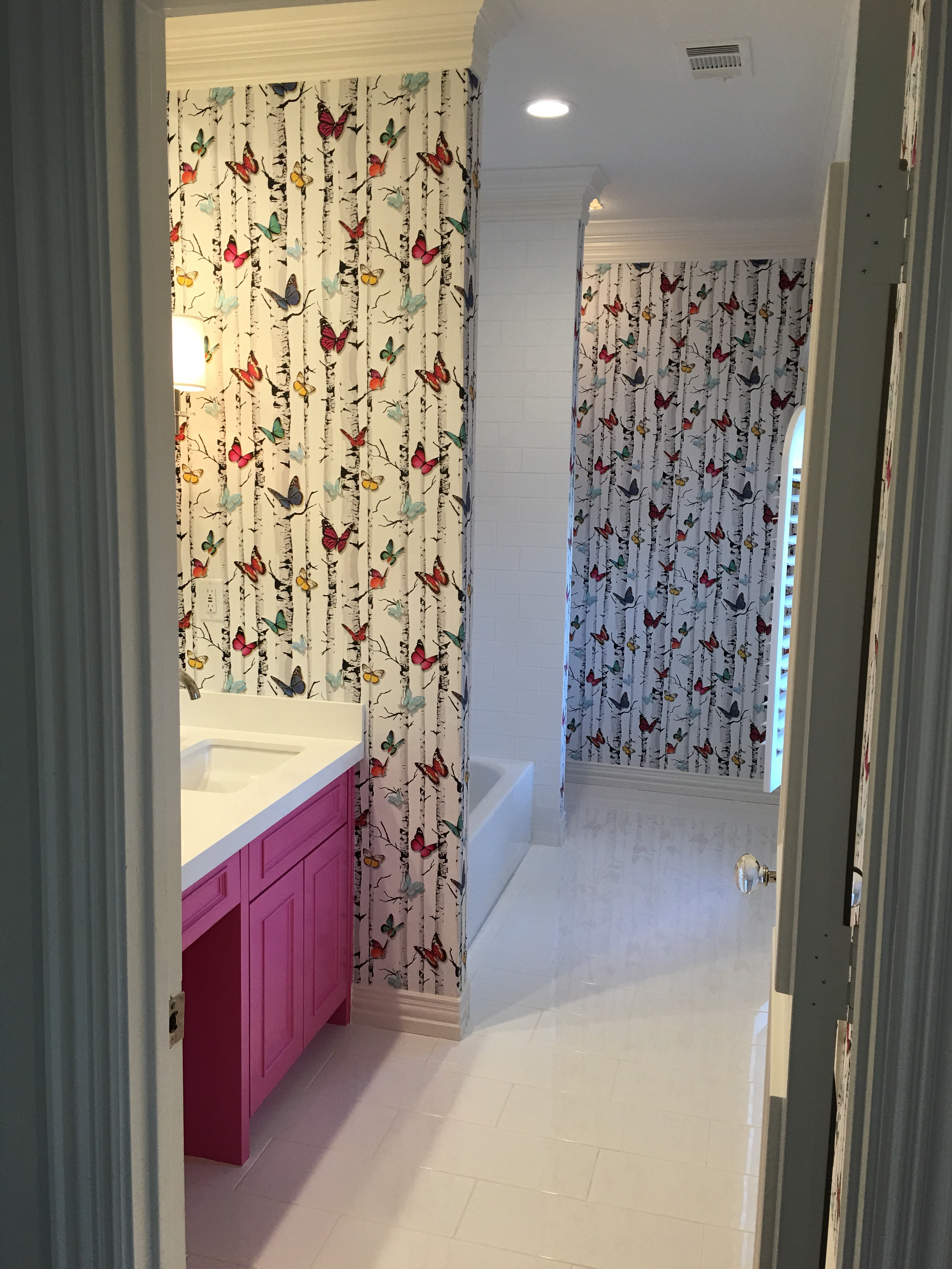 Here’s what her bathroom looks like today.
And a few photos of how her room looks today.
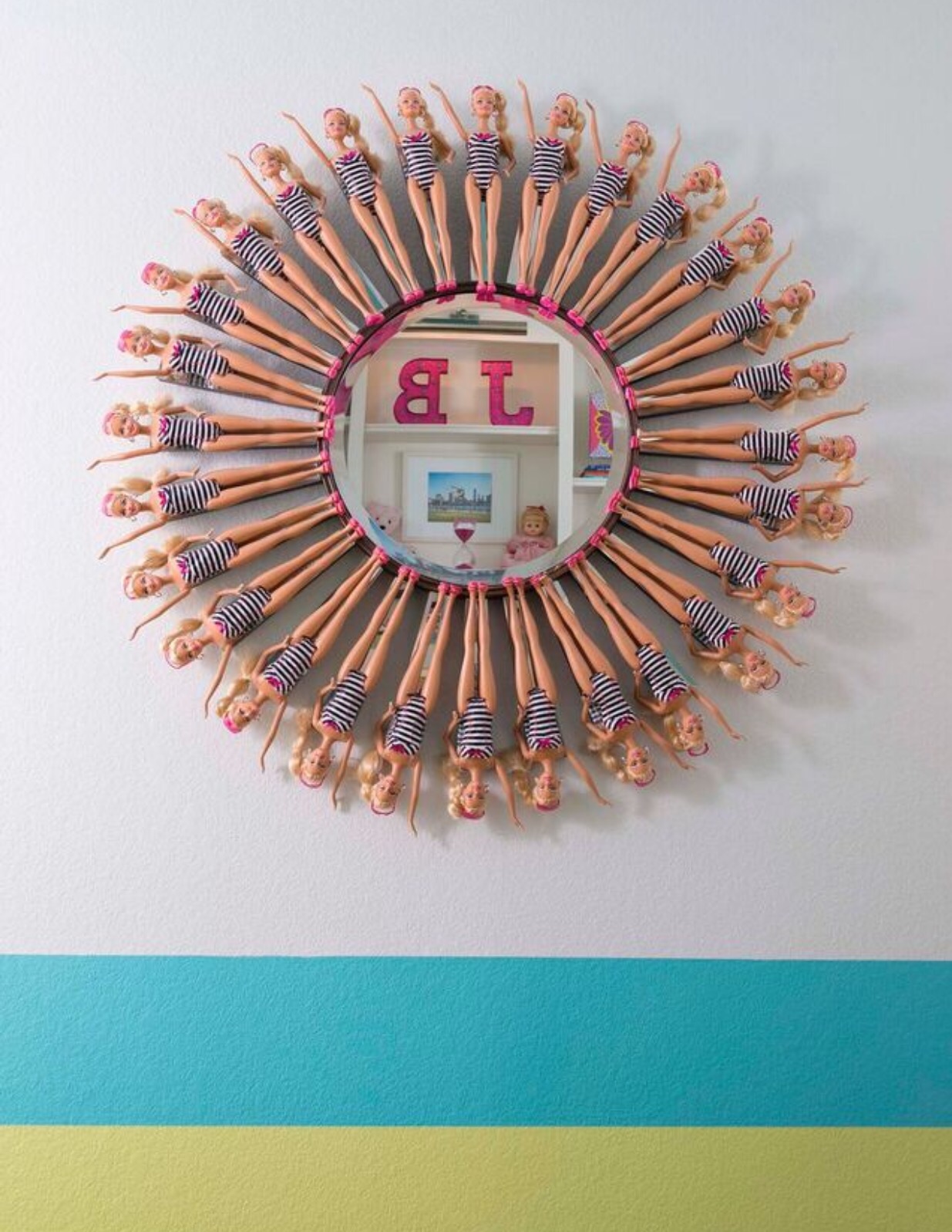
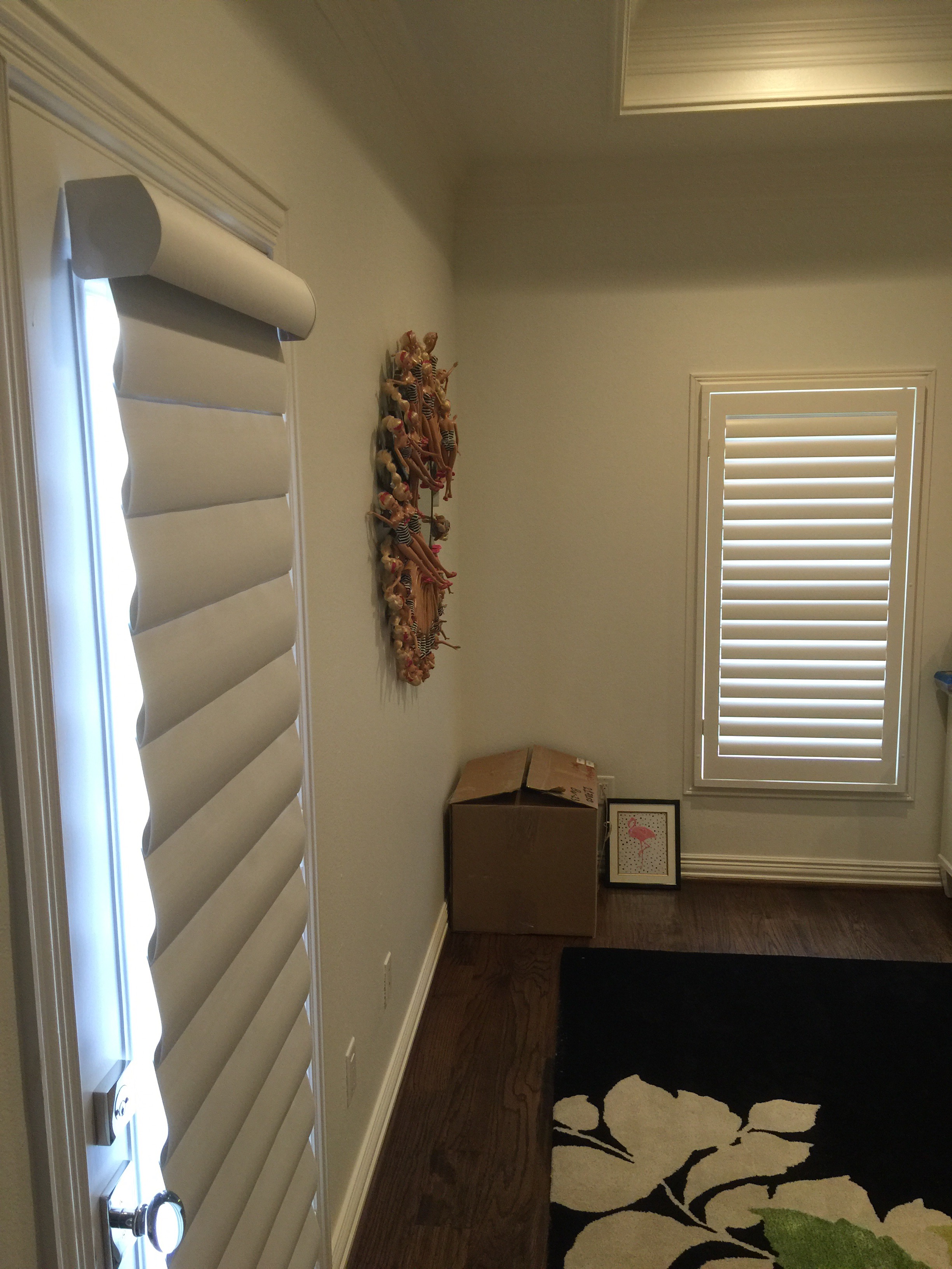 The Barbie mirror had a few casualties during our movie. Clearly I need to add fixing that to my “to-do” list.
This is what it’s actually supposed to look like.
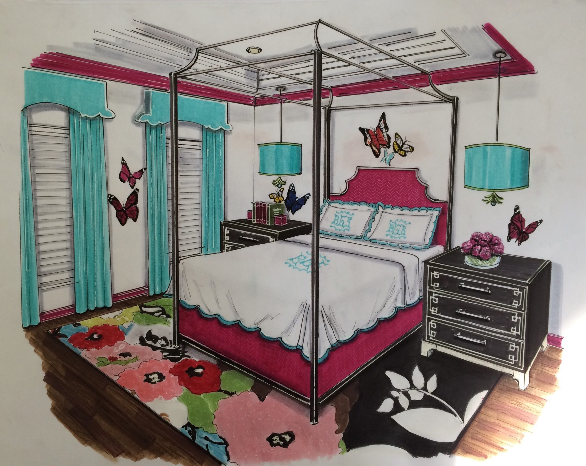
And here’s a sneak peek into our game plan:
As you can see, we have a lot to accomplish in just 6 short weeks! I’ll be back next week with more details of our plan & progress. Make sure you’re following me on Instagram for sneak peeks at Brooklyn’s room transformation & check back here every Thursday for updates!
Happy Designing!!!
Save

